This article was featured in Zeomag
Index
- Python: A blessing in disguise
- The dry dataset problem
- The preparation
- The tactic
- Insights:
- Looking back
It is quite perplexing to know that around 90 % of the the world’s data today was created in the last 2 years. With the advent of smartphones and wearables we have allowed numerous agencies to collect data (behavioural or otherwise) at a mammoth scale. This data on one hand opens up a vast sphere of possibilities but on the other, poses a unique challenge of handling this information.
Today we need sophisticated techniques that can help us to arrange, analyse and interpret data so as to draw meaningful insights. Seemingly useless dataset can sometimes expose unexpected results if analysed carefully. Therefore dealing with data is easily one of the most sought after skills in the present market.
Python: A blessing in disguise
The true potential of this language can be realised when it comes to Rapid Application Development (RAD). Python has a rich developer community who work continuously to churn out quality code. As a result, Python ecosystem has powerful libraries that can be effortlessly integrated inside the code to ease a programmer’s life. Therefore when it comes to dealing with data and drawing insights without losing too much focus, Python becomes a natural choice for most of the developers.
In this post too, we will be using Python to infer insights from the given dataset and by the end of this post you will be impressed by the rich toolkit Python offers for the same.
The dry dataset problem
Let’s have a look at the dataset that we will be using today. The problem dataset description is as follows:
“Contributors viewed 10,000 Google maps images and marked whether they were residential areas. If they were, they noted which homes were most prevalent in the area (apartments or houses) and whether the area had proper sidewalks that are wheelchair friendly.”
To be honest this is not the best description that should have accompanies this dataset, you will realize this fact once you start looking at the dataset. But here it is important to understand that, in the field of data analytics this is very common. You will be dealing with ill structured data, missing values, redundant records etc and yet you will have to draw insights from it. So let’s try to dismantle this dataset step by step.
The preparation
Let’s first set up our machine with the required environment. We will use Anaconda, it is one of the most python data science platform.We will be writing our code in Jupyter Notebook provided inside Anaconda package. Further, a lot of open source python libraries that will make our life simpler, you might have some of them, but you will need to import the ones that you don’t have. We will be using Python 2.7 over the course of this article.
The tactic
When it comes to data interpretation you need to understand the data first inside your head. For instance, You can start by asking questions like:
-
What kind of data is this?
-
What is this all about?
-
Are there any missing values?
-
What all attributes are there?
-
Is the data properly structured?
Questions like these will help you to connect with data even before you write a single line of code. You just have to use your logical instincts and then you will see the path ahead.
As we open the .csv file we can see that there are some missing values for certain attributes. Depending upon your goal you can decide how to handle such cases. For instance, you can just pad them with some default value or you can ignore them. For the sake of simplicity, we will ignore the missing values here. In this fashion we will be moving from some very basic conclusions to some deeper implicit inferences. We will be using some of the popular Python packages for the same. Let’s get started now!
Insights:
1. Curse of dimensionality
The given dataset has a lot of attributes( 21 attributes to be precise) So one way to proceed is to think about the kinds of relationships these attributes might have with each other. Can we neglect some of the attributes to avoid Curse of Dimensionality? For example, if some attribute has a constant value( or too many missing values) throughout the dataset, we can safely ignore it. Also if some attributes have a very high correlation then we can replace those attributes with a single representative attribute. Let’s explore this correlation between the attributes.
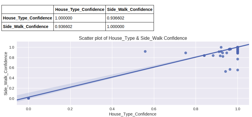
If we try to plot various attributes with each other we see that house_types:confidence and sidewalk_ok:confidence yield a very high correlation coefficient (0.936602). This indicates that we can safely ignore one of these attributes to reduce the dimensionality of the dataset. In other words we can say that when a person identifies what kind of house it is, they more or less identify whether the house has a sidewalk or not.
2. Comparing house types
It will be an interesting exercise to see how many houses of each type ( Private, Apartments and others) have sidewalks. Let’s see what the data has to say in this regard.
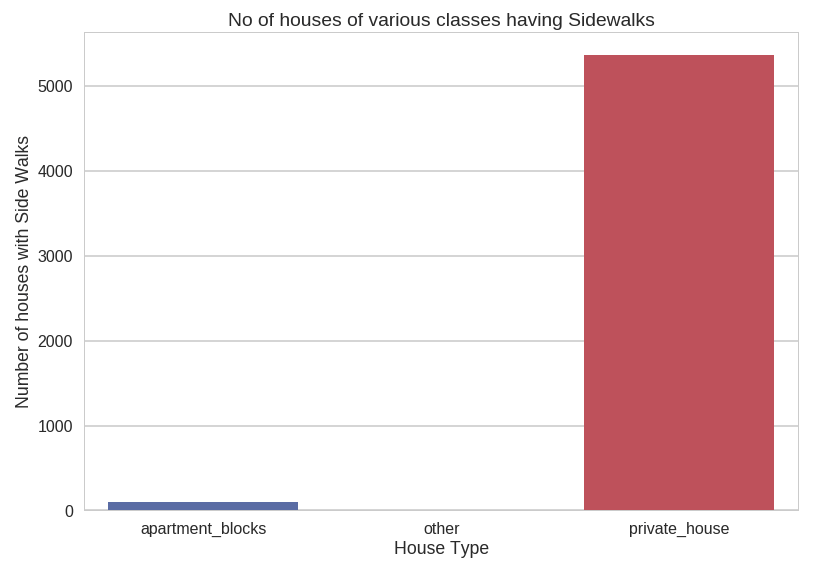
We observe that most of the sidewalks in the dataset are those associated with Private Houses while a very small fraction of the sidewalks are contributed by Apartments and other types of houses.
3. Fraction of residential and nonresidential houses having sidewalks
per class
Let’s now try to plot how many houses of each class ( Private, Apartment and others) have sidewalks based on whether they are residential or non residential.

Here we observe that residential and non residential private houses have almost the same fraction of SideWalks which are in turn similar to residential apartments.
But when we talk about non residential apartments we can see the fraction going up.
This can be explained if we consider the larger number of visitors when non residential apartments like Hospitals, Factories and Schools are concerned, better facilities like having a sidewalk ( for say wheelchairs) become a must.
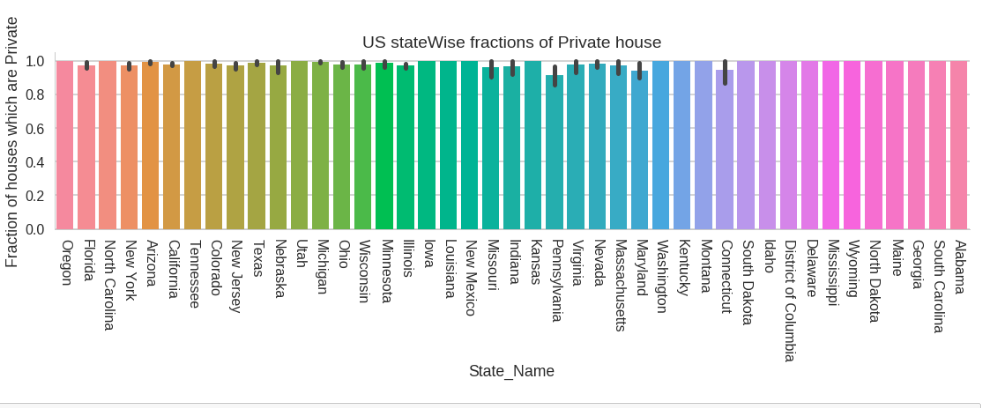
4. US state wise fractions of Private Houses
As we can see that most of the houses in the dataset are from United States, hence we can also focus our attention on US specific statistics.
It is often said that a populous city will have more of apartments for accommodating large population, let’s see what our dataset has to say about this.
Data speaks louder than assumptions.
We observe that the result doesn’t comply with our initial hypothesis as populous city like New York shows high ratio of private houses. It is okay to arrive at contradictions like this, as it opens up space for improvisation of the obtained dataset or the proposed hypothesis as a whole.
5. US state wise fractions of houses having sidewalks
Let’s see how the distribution of sidewalks is, in different US states.
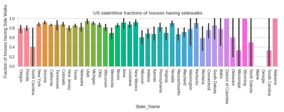
We can say that the states having large fractions of sidewalks have a higher level of civic life and are infrastructurally more advanced than those having lesser fractions of sidewalks.
This fact is further reinforced by the data of GDP here. The states having higher GDP have mostly higher ratio of sidewalks as well.
6. US state wise fractions of residential houses
Having a lot of attributes in a dataset means we need to experiment a lot to gain any tangible insights. Therefore let’s analyse the US state wise fractions of residential houses.
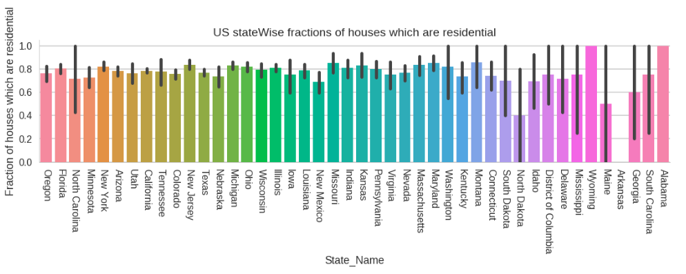
Here we can see the fraction of residential houses in each state. States having large number of residential houses suggests less industries as well as less population.
Also the states having more residences will consequently have better opportunities and standard of living. For instance, North Dakota is seen to have lesser residences and lesser fractions of SideWalks as well.
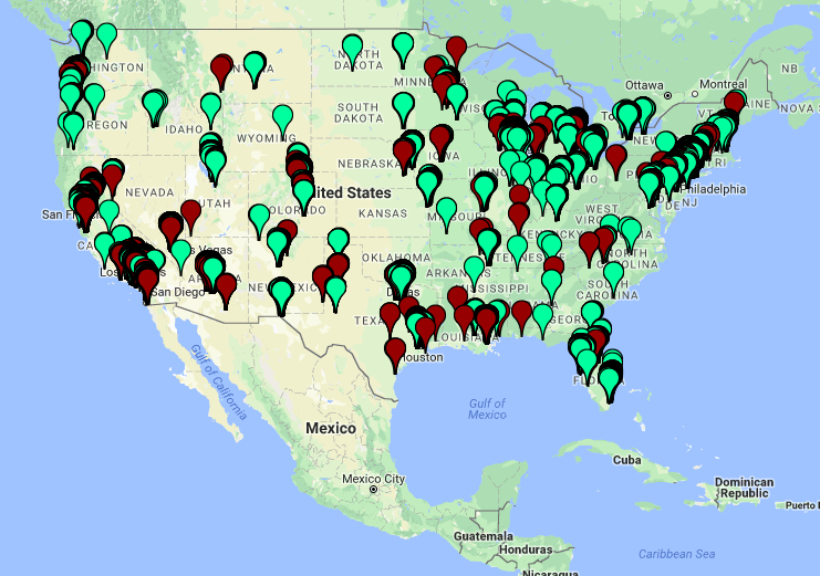
7. Plotting houses on a map
The data set includes latitudes and longitudes of houses, so it is a natural thought to explore any geographical insight that this data might offer.
Residential houses are plotted with Green.
Non Residential houses are plotted with Red.
You can get the house_plot.html from here.
We can observe that most of that the non residential infrastructure is closely associated with the residential one. This makes sense as the people working for the non residential institutes will come from the nearby residential homes.
Further, the residential houses are found in colonies (closely stacked) this make sense as most of the residences are built by the government under township schemes.
Also mostly the buildings are situated near the coast line due to favourable conditions of living near a water body.
Looking back
By this time I hope you must be pretty convinced why data is one of the most important asset of this digital age. We started with a seemingly dry and ill structured dataset and we were able to draw a lot of inferences from it. We also saw how Python along with its powerful libraries eased our analysis.
So where do we go from here? Knowing how to interpret data is one of the quintessential skills of today’s world and possibilities are endless. With a bit of practice and perseverance we can move a lot forward. In fact, sky's the limit.

